Choice List - Single Select Button Question
Multiple choice list questions that use buttons instead of traditional radio buttons are becoming increasingly popular, especially in online surveys and digital forms. This design choice can enhance user interaction and make the survey more engaging. Here are some key points about this approach:
- User Experience: Button-based choices can improve the user experience by making each option more visually prominent and easier to select, especially on mobile devices where tapping a larger button is more comfortable than selecting a small radio button.
- Visual Appeal: Buttons can be styled more dynamically with CSS (Cascading Style Sheets) and JavaScript, allowing for a more customized and visually appealing design. This can include animations, color changes on selection, and more.
- Clarity and Focus: Using buttons can help to focus the respondent's attention on the options available, making the choices clearer and potentially reducing the cognitive load involved in making a selection.
- Immediate Feedback: Button-based choices often provide immediate visual feedback (e.g., a change in color or an animation), reinforcing the user's selection and enhancing the interactivity of the survey.
- Accessibility: When implemented correctly, button-based multiple choice questions can also be accessible to users with disabilities. However, it's essential to ensure that these buttons are properly labeled and can be navigated using keyboard shortcuts and assistive technologies.
Despite these advantages, it's important to consider the context and audience of your survey when deciding to use button-based choices. For surveys that need to be accessible to a wide range of users, including those who might not be as comfortable with digital interfaces, traditional radio buttons might still be the best choice due to their universal recognition and simplicity. Additionally, the design and implementation of button-based choices should be tested across different devices and browsers to ensure a consistent and user-friendly experience.
Prerequisite:
This article is a continuation of the "Choice List Question - Single Select" article, so if you're new to Q-Fi make sure you read that article before continuing.
To create a single-select Choice List with buttons instead of the traditional radio buttons, follow these steps:
Step 1
- Edit an existing survey or create a new survey
- Follow the steps from the "Choice List Question - Single Select" article to create the choice list question or copy or use an existing choice list question.
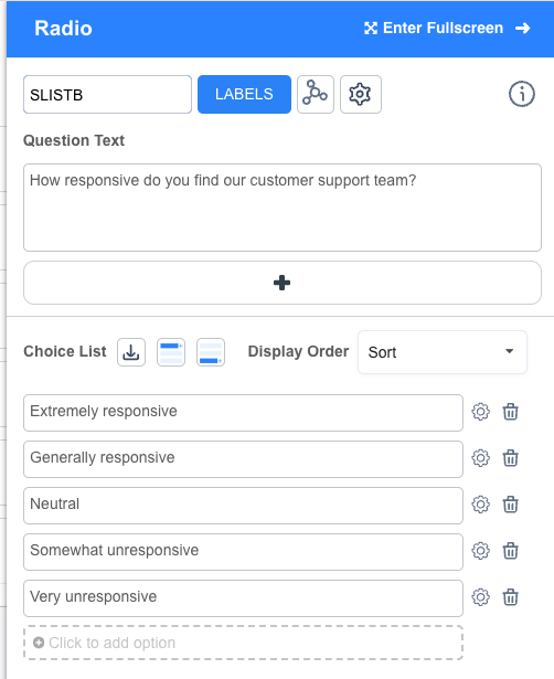
At this point you should have a question that looks like this example in the editor:

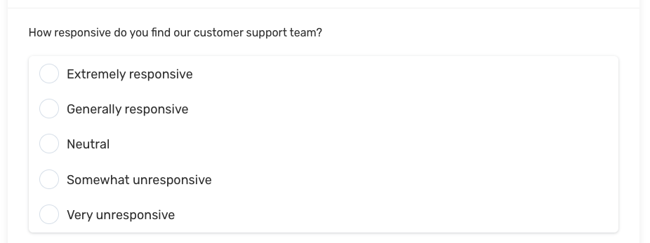
And should look like the following example when testing:

Step 2:
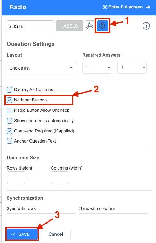
Now let's modify the question by going into the "Settings" tab:
- Click on the "Settings" icon
- Check the "No input Buttons" option - this will hide the radio buttons
- Click "Save" to save the question

All done!
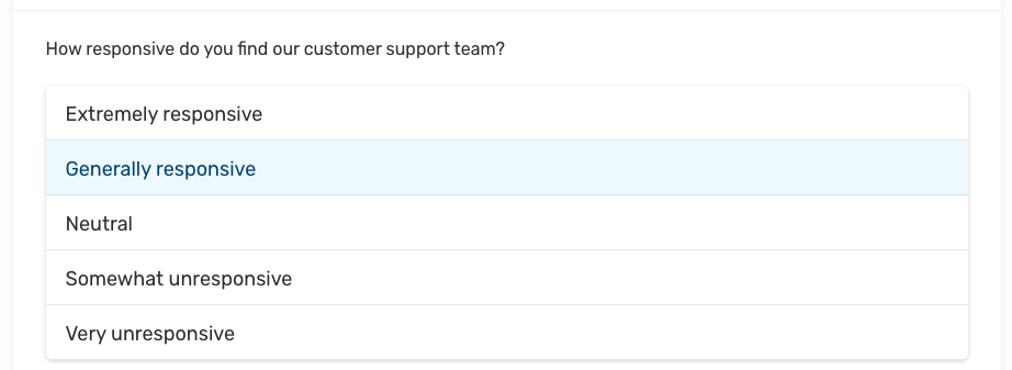
After publishing, you can preview your new single select button question and it should look similar to the example below:

Note: the look and feel of the question can be modified in the Look & Feel module.
